
Case Study
Teaching by doing
-
Summary
-
My team and I created a flexible digital grading platform for a startup that connects secondary school teachers with undergraduate education majors who want real-world experience grading student work.
Client
- The Graide Network
Role
- UX Design
- IxD Design
-
Team
- Stevie De LaCruz
- Jason Park
-
Deliverables
- User interviews
- SME interviews
- User and domain research
- Wireframing
- Paper low-fidelity prototypes
- InVision mid-fidelity prototype
- Axure mid-fidelity prototype
- Usability heuristic analysis
- Information architecture
- Interaction design
- User flows
- User stories
Project Brief
Who
The Graide Network is a platform that connects teachers who could benefit from extra grading bandwidth with undergraduate education majors looking for field experience grading and mentorship from experienced teachers. The Graide Network had just finished a successful first academic year pilot with a very minimal product that required the graders to manually download a .ZIP file and fill in an Excel spreadsheet. This was not a sustainable or scalable solution so my team was brought on to design a new platform that allowed graders to find available grading opportunities, apply and then grade assignments. My team’s task was to create the grading platform and the dashboard through which graders would find, select and apply for assignments to grade.
I led my team in designing a grader experience that was flexible for the full spectrum of users and easy for The Graide Network’s developers to immediately implement for the upcoming school year. Our solution was designed to fit into the busy schedules of college students, while also guiding them through a process of grading assignments that was informed by research into how experienced teachers grade.
What
In all the talk of the importance of education and of good teachers, we often think that the bulk of work as a teacher is in time spent with students, educating and building relationships. In reality, teaching is only half. The harder, less romantic work is in assessing students to gauge learning. Grading is essential for measuring student progress and a large part of the work a teacher does, but it usually occurs after hours, on weekends and between class periods—assuming there aren’t other work and life obligations.
Even for aspiring teachers majoring in education in college, grading doesn’t play as crucial of a role in teacher training. Students log field hours in the classroom shadowing teachers, but they don’t follow them home to watch them grade. When interviewing teachers, my team found that grading was one of the most time consuming and stressful parts of the job.
Constraints
- 2.5 weeks
- Our client finalized their in-house dev team during the project so we met with them to align our deliverables with their priorities.
- The next school year was roughly a month away and the client wanted to build out our changes as soon as possible. We adopted our design strategy to accommodate an Agile workflow and deliver a usability tested MVP design with a roadmap for future product improvements that we had also tested.
Research
How do you create value for the graders?
Meet the user’s needs and teach them something new
This was our central question. The value of The Graide Network was obvious to teachers: free help with grading assignments. What was less clear to us was what motivated already busy college students to grade papers in their free time. We were somewhat skeptical of the motivations of the graders, but wanted to approach our research with an open mind.
Our research had three goals to discover:
- What younger and veteran teachers wish they had known about grading before becoming teachers so that we could implement their grading knowledge into the grading flow for TGN.
- What motivates our users as aspiring teachers and to create a platform that met their career aspirations.
- How to fit the user’s personal goals and needs into a product that made the actual work of grading for TGN easy and educational.
We began by interviewing a combination of the best, worst and average graders from the pilot year and the most active veteran teacher who had used The Graide Network. We also interviewed current and recent teachers who had 6 or fewer years of experience. We chose to focus on younger teachers because we reasoned that they would be able to better empathize with and understand college students. We also assumed they would be able to more accurately recall their first few years teaching and the struggles that they encountered in grading workload, flow and strategy. The teachers taught at a variety of schools, including public schools in lower income neighborhoods, charter schools and elite private schools.
The Problem
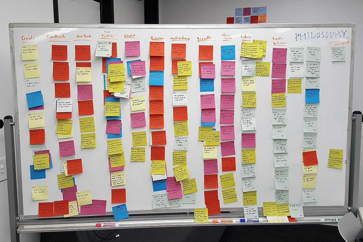
Affinity mapping user data helped us see the overlap between different users
After analyzing all the data from our interviews, we arrived at the following problem statement and design principles. We captured the essence of the graders’ motivations as users, for their careers and the things they didn't know about teaching that we wanted to try to incorporate into the TGN experience. We also cast a vision for the user experience across skill and experience levels that we identified among our interviewees.
Problem Statement
The current process on The Graide Network does not provide the educational resources, information about assignments and feedback necessary to give all graders the confidence to tackle and successfully grade any assignment.
Design Principles
-
Foster mentorship
Encourage graders to build relationships for guidance, growth and improvement
-
Cultivate teachers
Educate aspiring teachers with hands-on experience in a lower-pressure environment
-
Feedback-oriented
Feedback from the site, from teachers and from TGN
-
Streamlined and digestible
Only provide the essentials and don’t distract the user
-
Promote mutual value
TGN should be an ecosystem that provides value for everyone: students, teachers and graders
Moving away from ‘Personas’
Because we had a narrowly defined user base, our team found traditional personas less useful as a tool for empathy. Instead, we found that there were three independent spectrums, regardless of success or difficulty as a TGN grader, that were important for understanding our users.
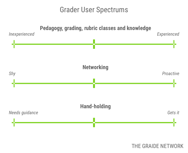
Spectrums of user characteristics in lieu of personas
Designing for an update path
When we came up with initial concept ideas, we divided up our designs strategically to test prototypes of varying degrees of complexity. In our competitive analysis, we looked at major players in grading and education and found that there was a variety of tools for grading that focused on integrated rubrics and grading in a dashboard that allowed for direct commenting on assignments.
Between the three of us on the team, we established a bare minimum of requirements for features and user considerations. We tested three prototypes of increasing complexity and automation for grading and less effort for manual data entry from the grader.
Design Considerations
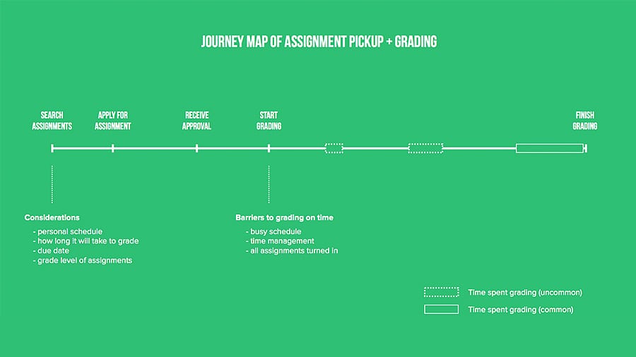
The process of grading for all graders followed this pattern of common pain points and time management problems
Remote TAs
When asked about having a non-teacher help them grade assignments, one of the main concerns that teachers brought up was that a grader might not have enough information about what's going on in the classroom or about individual students. From a prior UX team's research, as well as our own with teachers who had used TGN, we knew that the difference between satisfaction and dissatisfaction with a grader's grading often came down to how much information teachers gave about the assignments and class.
We needed to bridge the gap between the grader and the classroom of students they were grading. How could we provide them the information that they needed to be able to grade with the contextual knowledge and experience of a teacher in the classroom?
Teaching teachers
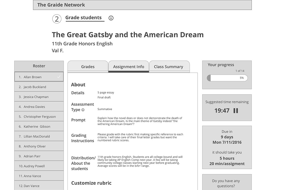
I was inspired by the Danielson Framework for Teaching, a well established rubric for measuring teachers. According to the Danielson Framework, a signifier of teaching excellence is that students have clear feedback on expectations and their progress, are able to assess themselves, and then are able to teach and assess other students. I required teachers seeking grading assistance from TGN to provide information that would allow the graders to better understand the goals of the assignment, the background context of the students and school, and the requirements of the assignment and grading expectations from the teacher.
This tested well with graders who wanted to know more about the context of the assignments as well as the teachers they were working with. This created more of a personal association with the teacher and an opportunity for mentorship through the built-in messaging system for questions about the assignment.
Understanding the user’s decision model
Graders we interviewed expressed reservations about grading middle school or early high school assignments because it had been so long since they had themselves done such work. We realized that they were selecting what assignments to grade from their ability to imagine themselves as the students. To counter this, I included increased information about the class, grading requirements and expectations, exemplars, information about the curriculum and the teacher and school. This gave the graders more information to feel empowered and more confident about grading assignments they felt less certain about.
College student schedules
Student graders apply to grade assignments, but teachers can also request them for grading. Grader priorities for applying and/or accepting assignments were based on a combination of factors, including time per assignment, grade level, subject comfort and their personal schedules.
Insights
What's the most you can do with the least?
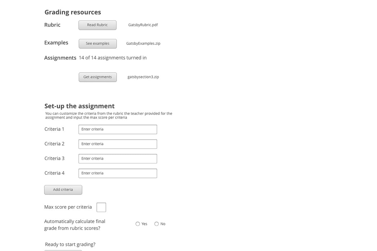
After a round of concept testing and meeting with the client to share our results, we decided to go with my concept. It was the least complex technically and the easiest to implement. In lieu of complexity and features, I focused on taking into consideration the main frustrations of the users we interviewed and what we learned from our usability heuristic analysis of the existing system. I wanted to create a flexible grading flow that accounted for the variety of types of assignments (.docs, PDFs, scanned handwritten work and Google Documents) and the variety of rubrics that teachers used to grade. This required a little more up-front work from the grader compared to other concepts we tested, but it was less work than graders had previously done. Furthermore, requiring the grader to read and manually enter in the rubric criteria before grading served as an extra guarantee that they would engage with the rubric before beginning grading. More importantly, it tested well and without hiccups and allowed for the most flexibility.
Making work out of required reading to engage the grader
Minimize distraction
A clear, linear user flow
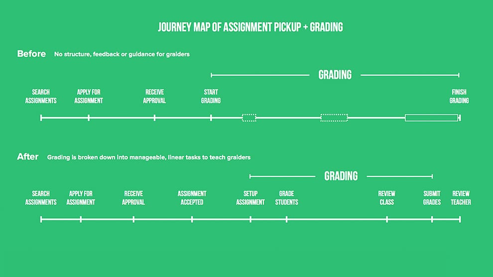
Comparing the user flow for the pilot to the final flow we designed
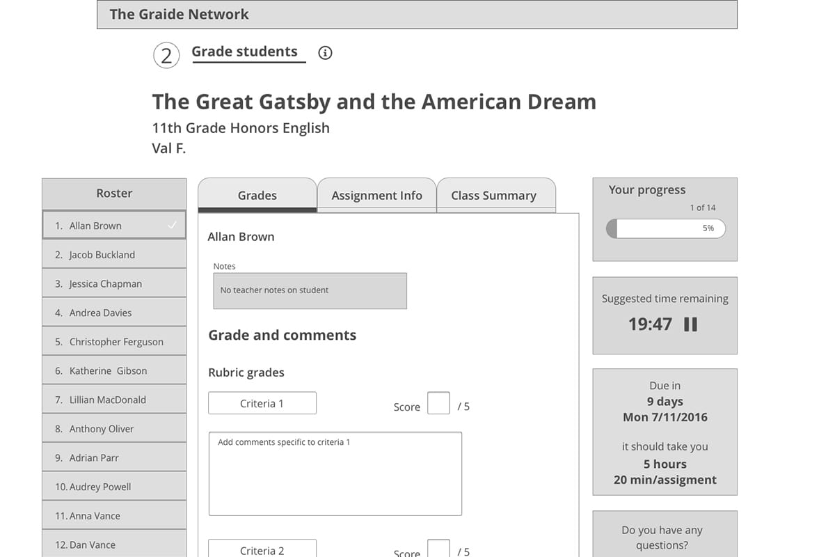
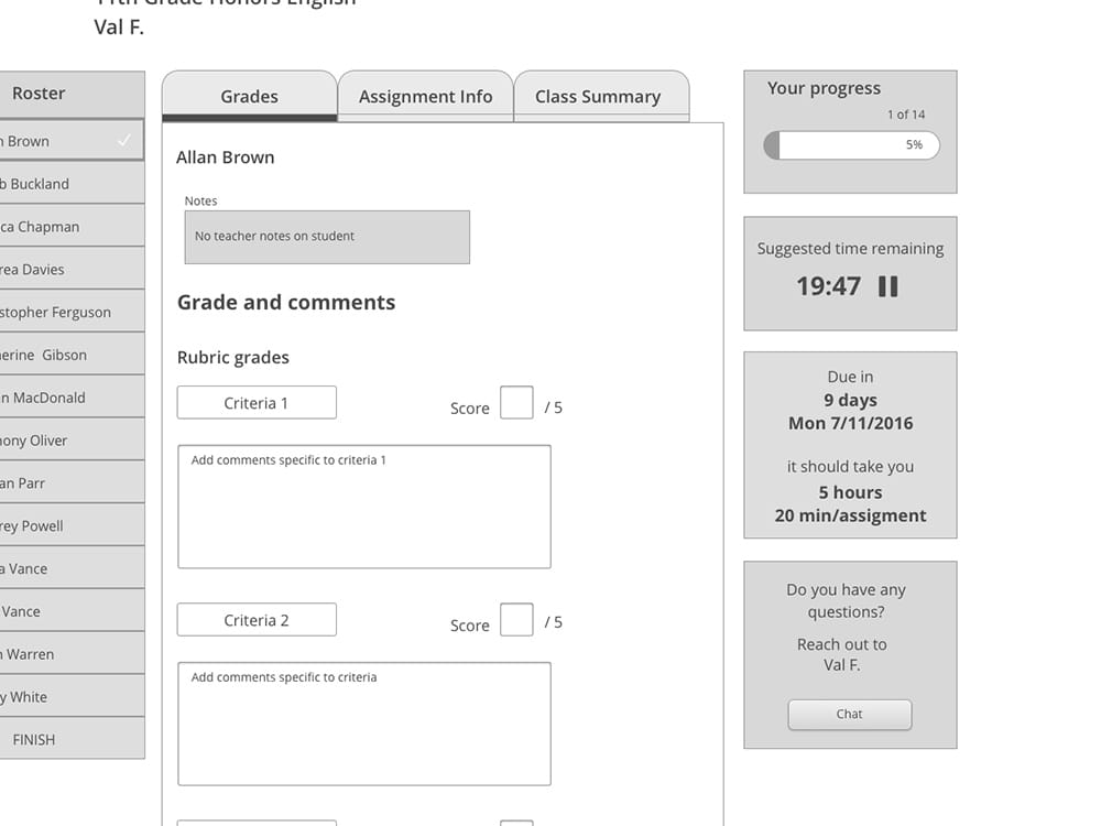
I wanted to reduce cognitive load on the user by putting all relevant information on the same pages with tabbed navigation. For each student, the grader could enter all rubric scores and comments on a single page and reference the rubric and relevant assignment information. The goal was to keep the user on as few pages as possible to let them focus on the actual task of grading.
Feedback, Feedback, Feedback
Side column roster
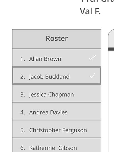
Previously, graders had to manually enter each student’s name into a spreadsheet before grading. Instead, the roster autopopulates and the teacher has the option to include notes about each student as applicable. As the grader works through the class, they can see which students they’ve graded and which they opened but didn’t finish grading as indicated by checkmarks.
Reviewing the class
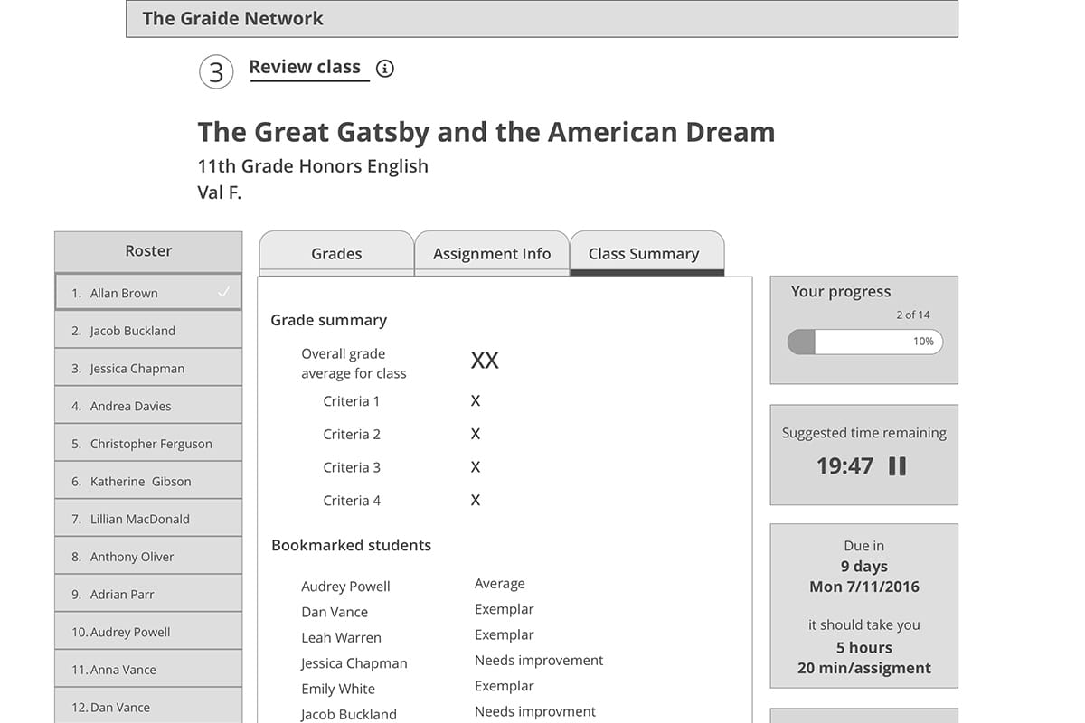
For each section of students, graders are asked to mark which students are exemplars as the best and worst students. Graders have access to who they’ve bookmarked as notable students while grading. After finishing grading the entire section, they’re asked to rank the students that were best and most needing of improvement again so they can go back through all the students and reconsider. This information helps them ensure they’re grading fairly across the class for this assignment, provides valuable data for the teacher when they receive the graded assignments, and works toward providing data on individual students for future assignments with The Graide Network.
Time Management
From teachers to student graders, the largest obstacle for everyone we interviewewed was time management. Teachers don’t have enough time in the day to do all their work. College students are notoriously poor at managing their time especailly with their busy schedules. Further, we found that the average time a grader spent on an assignment (30-90 minutes per student) was significantly longer than what the average teacher spent on even much longer assignments (10-30 minutes). I wanted to design a feature that would give student graders a realistic idea of the time per assignment they would spend as teachers. I also wanted to address the problem graders we interviewed had with keeping track of their schedules and fitting TGN work into their lives.
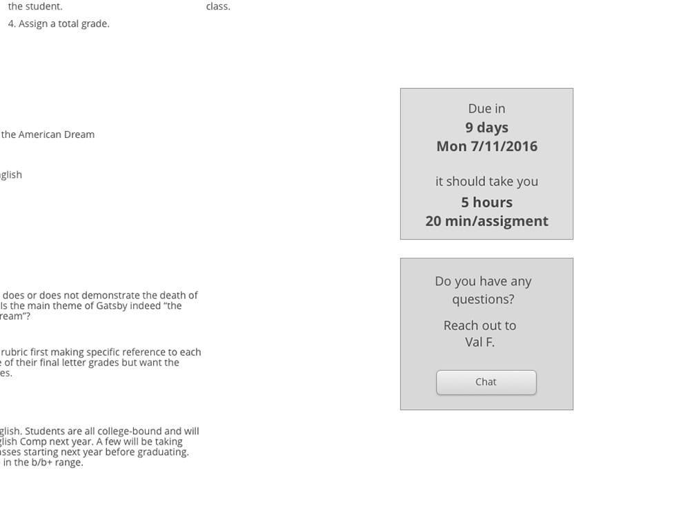
In response to this, the final design includes an average time per assignment target given by the teacher based on how long it would take them. There is also a timer that provides the grader with time spent on the current assignment, time spent per assignment on average and overall time for grading. This feature was well received by graders in usability testing and by The Graide Network, who had struggled with finding ways to reduce the time that graders were spending grading, leading to stress for the graders as well as delays for the teachers.
Communication and Context
Creating an environment of open communication and mentorship
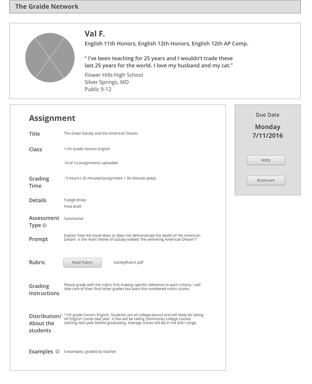
The assignment description was redesigned to reflect the considerations and needs of graders when picking assignments to apply to grade
From user interviews we identified that one of the main motivations for graders in signing up for The Graide Network was the opportunity for mentorship. They saw the experience as inherently useful to them as future teachers. They also saw opportunity in learning about the way teachers approach assignments. What they missed was the sense of personalized feedback beyond a review score they received from the teacher for their work and their contact with TGN staff. Individually keeping in touch with graders was a sustainable task for TGN staff during the pilot, but moving forward, they needed a better solution.
Providing the graders with more information about the teacher and class proved helpful. It gave graders more information about the work they were grading, but also tested as giving more of a sense of who the teacher was. Additionally, I included an option for teachers to provide individual notes on students for the assignment to help contextualize the assignment. This was a concern that teachers voiced when discussing graders who weren't in the classroom. They were afraid that an outsider wouldn't have the specialized knowledge of a student to grade them fairly. The teacher notes on the class as a whole, where they were in the unit and individual student notes were designed to assuage these concerns. Finally,
We also introduced an integrated chat feature to make asking the teacher questions about the assignment intuitive and accessible. Previously, they had to use a separate messenger page. We also consulted the developers on integrated chat implementation based on the stories we'd heard from users.
Doublechecking
Checkpoints to guide and teach the user through the process of grading
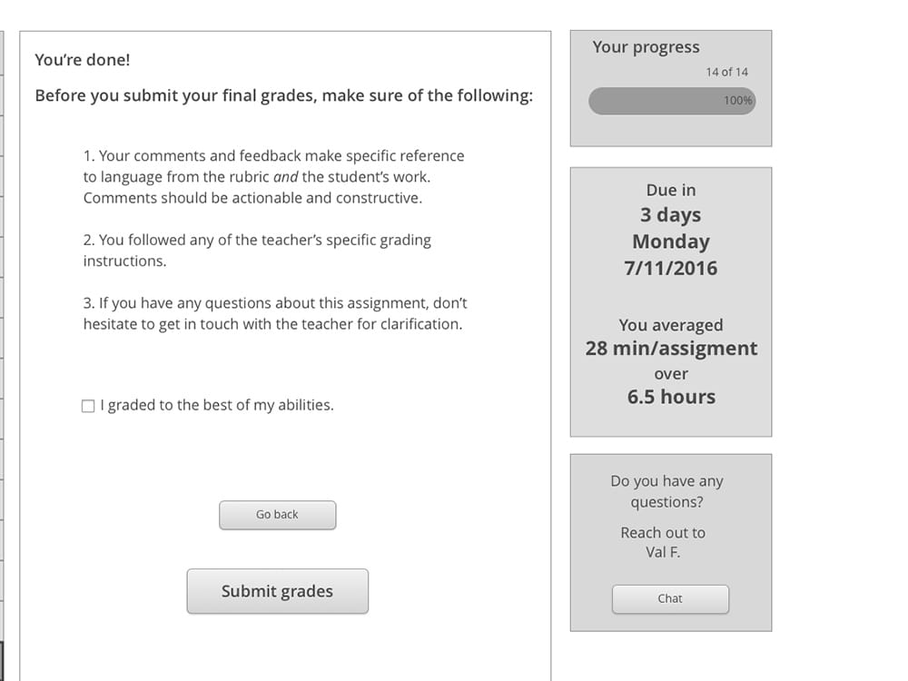
Throughout the flow, graders were required to confirm they had reviewed all the provided assets. The same information is presented in a similar format to reinforce familiarity and make it easier to find and reference the same information.
Even if the grader clicked their way through every screen, once they’re actually grading assignments, the same information they were supposed to read was always a click away in an Assignment Info tab, including requirements and special instructions from the teacher and any files for grading that might have been lost.
Familiar and consistent design for current users
Since we were only designing for one part of the experience for half of the users, it was crucial that the designs remain in line with familiar interaction and layout patterns.
Concept testing and final designs
Moving forward with my design, we integrated features from the two other concepts that tested well with users and bundled the rest of the features from the other concepts into our feature update roadmap for their development team.
See the PrototypeOutcome
Designing for the user and the client
By testing concepts that were representative of different levels of complexity for the grading platform, we were able to provide user-tested recommendations for future revisions for their developers, even though our chosen solution required more manual input from the users. After we met with their developers, we had a better understanding of their top priorities for their database. One of the members of my team was a developer by training and under his guidance, we were able to pivot in the last few days of our project to include an information architecture chart that mapped the data fields and relationships, making it easier for their developers to implement our designs.
Tackling the information architecture also informed our future improvements roadmap with specifications on the data needs for each of those iterations to our design.
I wish I had this when I was a teacher
With the tight timeline we had for this project, we were only able to schedule one round of a few usability tests with our final prototype. We tested a combination of graders who knew the old system as well as former teachers and TAs. The results were overwhelmingly positive about the intuitive and straightforward flow. The former teacher actually remarked in the middle of the test that they would’ve liked a grading platform like this when they were going through papers. This helped affirm our goals of creating a grading platform that would suit a variety of grading styles and skill levels.
Final deliverables and update
Finishing off the project, we handed off our final designs with full annotations explaining the research and thinking for the TGN team as well as for their developers. Prominent in the annotations and documentation we presented them with were the results of our testing for more advanced versions of the dashboard. Based on our understanding of their development priorities, we were able to provide them with a roadmap for future iterations they could make and the priorities they should have for evolving the product to better suit the users.
After we wrapped up, a UI team began working on realizing our designs and the platform is currently under development, with plans to launch during the 2016-17 school year.